| NY Arts: How did Esopus start, and how has it grown since? Tod Lippy: I started Esopus—named after a creek that runs through the Catskills—in 2003. The essential idea was to create a magazine with no "commercial interference": no ads, publicity, or calendar-driven material, and for which I would never rely on handlers (publicists, gallerists, etc.). I referenced the Esopus Creek because it is an exceptionally pure stream before it hits the Hudson, where it gets subsumed (similar, in a way, to what happens when a magazine hits the newsstand). Esopus is nonprofit to make up for a negative margin; the magazine costs more to produce than it sells for. |

|
Tod Lippy is the editor-in-chief of Esopus, a contemporary art publication out of New York.

NY Arts: How did Esopus start, and how has it grown since?
Tod Lippy: I started Esopus—named after a creek that runs through the Catskills—in 2003. The essential idea was to create a magazine with no "commercial interference": no ads, publicity, or calendar-driven material, and for which I would never rely on handlers (publicists, gallerists, etc.). I referenced the Esopus Creek because it is an exceptionally pure stream before it hits the Hudson, where it gets subsumed (similar, in a way, to what happens when a magazine hits the newsstand). Esopus is nonprofit to make up for a negative margin; the magazine costs more to produce than it sells for.
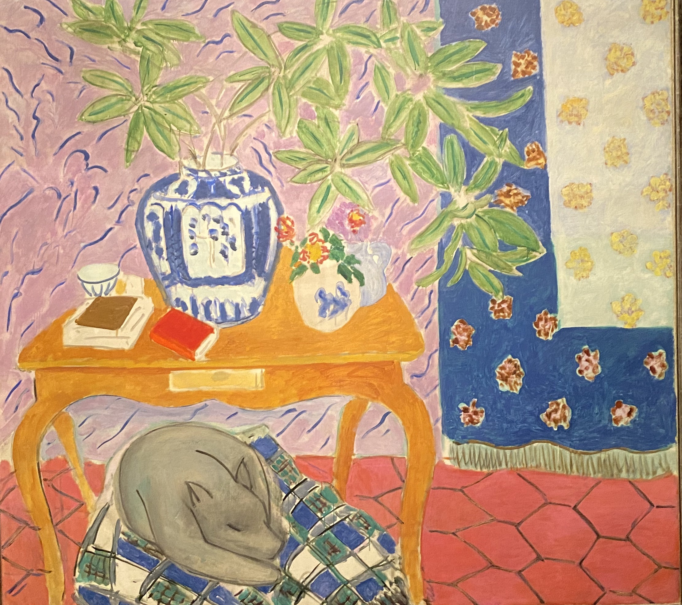
The most important thing to me as publisher, designer, and editor, is to be as invisible as possible when presenting content: let each piece speak on its own terms. Things can end up seeming a little jumbled when you’re flipping through an issue, but the payoff is that each thing holds its own ground and somehow retains its “object-hood.” This is particularly important for the visual essays with found objects and, of course, the artists’ projects.
NYA: We love that the philosophy of Esopus is so punk but the look is so luxe. Were you punk?
TL: No, not really. But there’s that quote from Flaubert: “Be regular and orderly in your life, so that you may be violent and original in your work.” There is something appealing about putting together a project that is formally "beautiful" but not necessarily predictable—or maybe sometimes even disconcerting. But the philosophy really just had to do with my being so fed up with the hyper-mediation of everything.
NYA: One of the standout features is a wealth of, for a lack of a better word, simulacra. For instance you’ll switch your paper stock to replicate the feel of actual notebook paper if you’re publishing a page from a notebook.
TL: My feeling is that the frame—the magazine itself—is so clearly demarcated that reproductions could never be mistaken for the originals. You summon up Baudrillard, but I’m thinking of Benjamin’s contention that mechanical reproduction necessarily removes the aura from the original. I really want all of these things to have that aura. I would love for people to feel like the copy of the alphabet primer that Kay Rosen contributed for her artist’s project in the latest issue actually feels like the original. It’s really just about keeping things "as they are," as paradoxical as that sounds.
NYA: And how do the CDs packaged into each issue relate to the visual work?
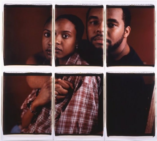
TL: From the beginning I wanted to make the magazine as multidisciplinary as possible—I didn’t want it to just be an "art magazine.” But I also didn’t want to ask bands for stuff they had lying around to throw on a compilation. I decided to theme each CD, then commission songs from musicians based on the theme. For the new issue our guest editor Mike Powell asked subscribers to send transcripts of their dreams, then musicians each picked one of these to write a track about. Selected dreams are published (along with stunning images by Danny Gordon) so that readers can take a look at them before listening to the songs.
NYA: Do you have any personal favorites in Esopus’ archives?
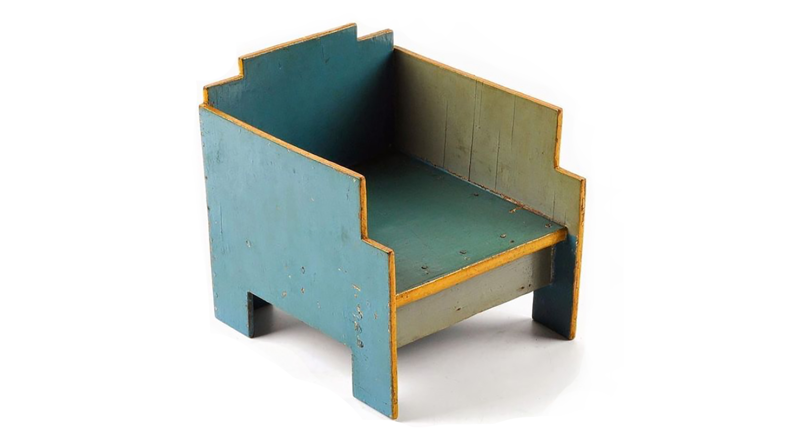
TL: I love everything that’s been in the magazine (the advantage of being the only person on staff, I guess). A highlight for me was Bill Christenberry’s artist project in Issue 2—a pop-up sculpture assembled and glued by hand by a Hutterite colony in Winnipeg (where our printer is located). I was honored to introduce Mark Hogancamp in Issue 5. He’s an artist who creates photographs of military dolls and hand-built models as a way to recover from a debilitating brain injury. But there really isn’t anything that’s been in the magazine that doesn’t make my day one way or another.