|
Beverly Fishman: I don’t believe that you can paint without thinking about painting’s history, and your relationship as an artist to other artists who came before you. At the same time, when I paint, I am thinking more about Pop and Minimalism than Abstract Expressionism and Color Field. From Minimalism and Post-Minimalism I get the tension between the handmade and the mechanical and an interest in using industrial materials – metal and enamel paints – to make art. |
|

“the consciousness I portray is much more fragmented, pulled in different directions through drugs, medical imaging and the mass media.”

Beverly Fishman, Untitled, 2011. Enamel on polished stainless steel, 26 x 18 in.
Courtesy of Galerie Richard, NY
In Conversation: Joe Fyfe Interviews Beverly Fishman
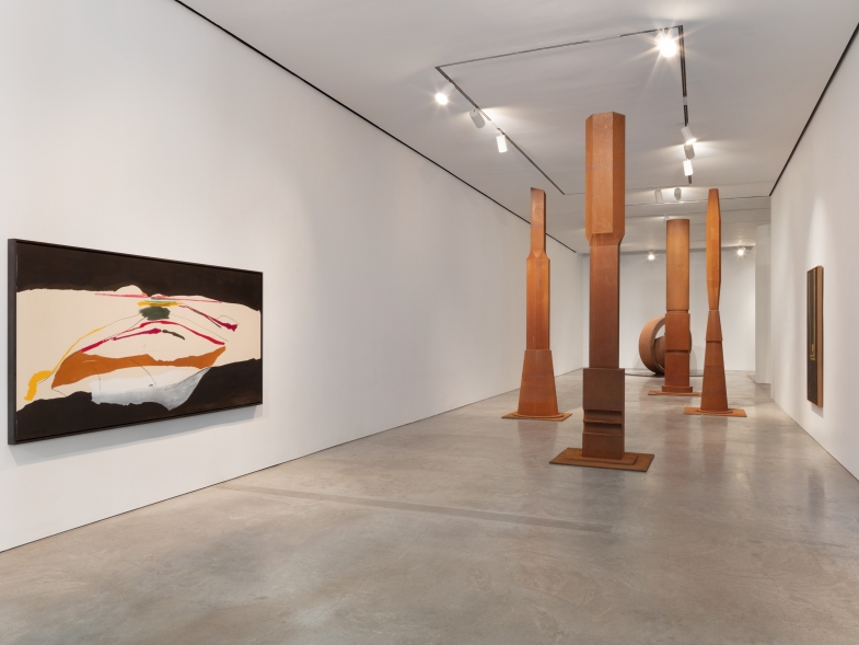
Joe Fyfe: There is a historical consciousness present in your paintings that is also veiled. I am referring primarily to Color Field via Pollock, Noland, etc. I don’t bring this up so much to underline any intention, particularly, on your part, but more to reflect on how the large abstract horizontal pictures that make up a considerable portion of your current exhibition cannot but help address their relationship to the post-war history of painting, which is pretty much what we have when dealing with larger-than-easel-sized abstractions, you know?
Beverly Fishman: I don’t believe that you can paint without thinking about painting’s history, and your relationship as an artist to other artists who came before you. At the same time, when I paint, I am thinking more about Pop and Minimalism than Abstract Expressionism and Color Field. From Minimalism and Post-Minimalism I get the tension between the handmade and the mechanical and an interest in using industrial materials – metal and enamel paints – to make art.
From Pop, I take a love of the screened image and an interest in the mass-reproduced icon: in my case, capsule forms and pill forms as well as drug logos. But you are correct in pointing out that Post-1945 American painting still looms large over any attempt at abstract – or in my case, mostly abstract – painting. When I think about Pollock, I like Rosenberg’s idea of action painting, the painting as a record of events through which the artist heroically expresses a struggle to create a new form of postwar identity. The question of identity with which my work engages, however, is identity in a much more medicated and media-saturated society.
JF: Someone like James Siena gets around references to Abstract Expressionism and Color Field by working on a diminutive scale, but then a catalog essay comes along comparing his enamel-on-metal paintings to Pollock, then the jig is up. Which brings me to other Pollock references in your work – the fact that you are working with enamel on a mirrored surface, something very much like Pollock’s use of enamel and silver paint.
BF: Pollock is one of the figures who started to push painting toward the machined and the industrial, but so have a lot of other artists. For example, I love Michelangelo Pistoletto’s mirror paintings of the early 1960s, with their figures turned away from the viewer. I use a mirrored surface to make the viewer’s bodily experience and movements more a part of my paintings. I want you to experience the painting while gradually becoming aware that my gestures are very mediated and that the overlaid lines and patterns are actually representations of physical and mental processes. My interest in making my paintings environmental can perhaps be traced back to the postwar American painters. But I don’t think my paintings express the same attitude. I think of Pollock or Newman presenting a heroic struggle to make meaning. I try to do the same thing, but I think the consciousness I portray is much more fragmented, pulled in different directions through drugs, medical imaging and the mass media.
JF: I find it fascinating how the painterly element does very much exist but it is subsumed: appearing in the occasional off-register jumps that take place when the waving black lines overlay some of the color under painting.
BF: Integrating the handmade with the mechanical has been central to my work for more than two decades. Through painting I attempt to fuse my human touch and sensibilities with mechanical processes and the cold sterile forms of scientific and medical data.
JF: Though I realize that the paintings depict, as it were, the overlapping of digital readouts of EKG, neuron spikes and bar codes (the latter actually exist in tangible two-dimensionality) I was struck by–again in the large horizontals—how they reminded me of the intricate patterns one finds when looking closely at paper money.

JF: In a sense, you use traditional late-modernist formats, field-size horizontals, semi-detached panels, etc., but they represent a different space, even a different speed…
BF: I attempt to represent a fragmented space of multiple speeds. I think of my everyday life where I’m constantly looking at three screens at once. In my paintings, I imagine multiple screens changing at different rates, images passing through a sequence of monitors, and data displays registering multiple, possibly contradictory streams of information. I am trying to capture my experience of space as mediated and multilayered. And when I think about computer screens, I also think about Pop art and silkscreens. That’s perhaps why I have an interest in moiré patterns. Moiré patterns are interference patterns produced in both analog printing and digital imaging. They exist in my paintings to suggest the constant cycling of images through different forms of mass reproduction.
JF: I must mention how beautiful the smaller format verticals were, they seemed reminiscent of various examples of Japanese art, like the sixties posters of Tandanori Yokoo, the proportions are exquisite. I want one.
BF: I love the sixties prints of Eduardo Paolozzi. They are just fantastic! Thanks so much Joe!