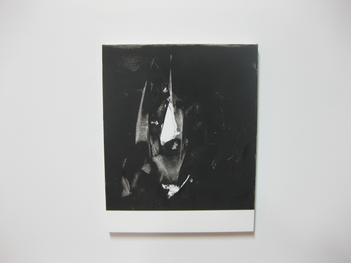
Michael Brennan, Athena Behind Achilles, 2012. Oil and wax on canvas, 20 x 16 in. Courtesy of the artist.
Jason Stopa: One of the most striking aspects in these new works is the kind of back-lit illusionism that is present in the handling of the paint. It reminds me of Pollock in that Hans Namuth film, where he is painting on screen to create a certain liquidity. Your work references paintings’ reproduction via the internet, and yet simultaneously declares itself as an active agent that can only be experienced in person. Are your paintings’ liquidity, their present-ness, important factors in how people interact with these?
Michael Brennan: In the Namuth film you see Pollock painting through a sheet of glass, arranging bits of mesh and other materials within the black enamel. It’s very revealing. Sadly afterwards, Pollock felt as though he had given up his secrets, lost his mojo. He went inside, downed an entire bottle, then flipped over the Thanksgiving table—according to legend. I think good painting leads a viewer through the process of its own creation from beginning to end. The act of revealing is what animates any painting.
I originally began this series with ink on paper. I was drawn to the unruliness of ink. Unlike most abstract painters, I don’t mind having any allusions to imagery. The 20 x 16 in format I favor is a constant, a standard.
I work quickly with the knife and when I feel that I’m recognizing something, when I feel like there’s something there, that’s when I stop. I don’t want it to be a hidden image, more of a flash of something. When I ask my son what he sees he says, “Batman.”
MB: Flint, what do you see in this painting?
Flint Brennan: I don’t know. I see a ring at the bottom.
MB: We’ve been reading The Hobbit and are about to start The Lord of The Rings. All Laugh.
JS: I like that the new work has titles that reference some loaded topics – The Iliad, Brooklyn, Batman, Wu Tang. All of these have characters or characterize a situation that is down and out. Can you talk about this?
MB: In every bad neighborhood you’ll always find a comic book store. Comics are a way of escaping and transforming the shabbiness of everyday urban life; the Wu-Tang recreated Staten Island as Shaolin and that’s perfectly acceptable. I’m interested in the minor characters of the Iliad, not the heroes, but the warriors who get gorily wasted page after page. Like Homer, I want to restore their humanity, I want to level and localize the Iliad. I like the Fitzgerald translation, its one-two rhythm reminds me of hip hop – stripped down, punchy. Artists constantly borrow from these narratives; Virgil borrowed from Homer to meet the needs of Augustan Rome. I want to borrow from Homer to suit the needs of contemporary Brooklyn, which seems entirely appropriate to me in this age of avatars. I’m interested in making a heroic anti-hero painting. I just watched the movie Kick-Ass, and I would say the world of comics has moved past the cynicism of say the Dark Knight or the Watchmen, and we’ve entered a new age where heroes are being leveled and de-professionalized.
My early work was more aligned with geometric abstraction. And I left it to flirt with a kind of quasi-pictorialism – a big no-no in abstraction.
JS: Yes, but there is still the bottom edge, which…
MB: Which references ideas about abstraction that go back to the Carter administration. [laughter]
MB: But, I don’t like dogmatic abstraction, I’m sick of it.
JS: Let’s talk about that black. It has a matte quality to it that’s pretty grainy and filmic up close.
MB: It’s a gritty, slate black, something like ground up chalkboard. I was using mostly cold blacks until the painter Nat Meade suggested I try slate black, which is warmer and has a larger particulate. For me it was a game changer, a significant shift. My work is often compared to David Reed, William Wood, and Mark Sheinkman’s. My work is not so Rococo, less finessed; rougher and uglier, neither so grand nor pretty. Although I like allusions to photography and printmaking, their work has a photographically retouched quality that I’m not so interested in for myself.
JS: Lasker’s new works have a bit of this quality. A little too clean. I recently saw his early work, which I found very interesting.
MB: That’s right, he recently had a show up of his very early work. Those early paintings are so wonderfully post-modern in a late 70’s New Wave faux-retro, mid-century modern, boomerang end-table kind of way. I remember seeing Lasker’s work in 90 or 91 at Sperone and thinking that those paintings felt so strongly of their own time —that he understood his own moment so correctly. I bet it was like seeing Warhol in 1960. They were so forceful and new.
JS: What about the scale of these works. It looks there are several of this smaller size. Are they all small paintings?
MB: I think it’s fine for paintings to be colossal when size is germane to their content, as is the case with Barnett Newman, but a lot of big painting is really just inflated. Also, we no longer live in the age of Cinerama, we live in the age of the iphone and the ipad—smarter, smaller. Screens and paintings nowadays engage viewers face-to-face rather than body-to-body. There’s also a difference between size and scale. Scale is about a proportional relationship. You can have a large-scale small painting and a small-scale large painting. Across the art world “large scale” is erroneously used to just mean big, it’s more complicated than that, but that’s just a pet peeve of mine. I think about scale a lot.
JS: I’ve thought about this in relation to my own work. That in order to keep painting, one must really believe in the efficacy of painting.
MB: There will never be a last painting. Painting can too easily accommodate the ideas of any era. Matthew Ritchie converted the conceptual armature of Matthew Barney’s work into a model for painting in the 90’s; something like Tiepolo where everything is flying around and any available surface can be painted upon. Maybe one can’t easily afford to make a feature film that accurately reflects our age, but one can always make a painting.
We are moving beyond a cynical approach to painting and art in general. One positive thing I’ll say about the New Casualists is that I like the sincerity of their intentional oafishness. Laughs
We’ve moved on from the high, sophisticated irony of Jasper Johns to the now lowest possible irony of the Wild Whites of West Virginia – we’re left with nowhere else to go.
JS: It’s so true. Where are these works headed next?
MB: I’m showing in Mexico City soon at Fifi Projects. Of course, this is such a Brooklyn based project that I’d like to show it here too, be it at Minus Space or someday The Brooklyn Museum. I like the idea of showing locally, which is part and parcel of the work.