In
the ’70s, people talked about "pluralism." A range of work was on
view, but most fell into two categories. One was conceptual, video, performance
and process art, and the other, hyperrealism. Hyperrealism sold well, but
critics preferred conceptual-video-etc. It provided better opportunities for
discussion, but was hard to hang on a wall, so it wasn’t selling that well.
This disagreement between buyers and critics ended in the ’80s with
neo-expressionism, which was figurative enough for buyers who had liked
hyperrealism, but so rich in idiosyncrasies that critics had lots to talk
about. |

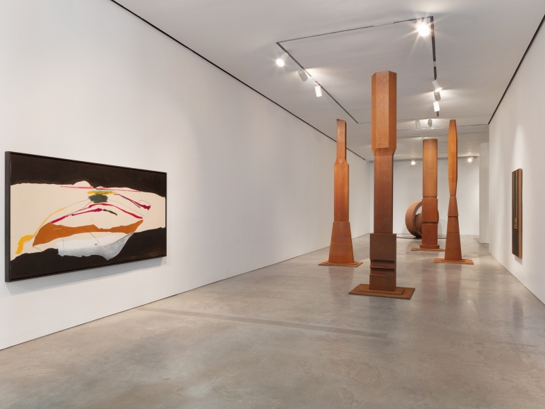
Kenneth Noland. AM. 2003. Acrylic on canvas, 58″ x 116″.
|
|
Nowadays, the scene is again marked by
pluralism, but this time with an economic base for the critics’ choices that
has developed over the years. Reviewing an exhibition of Jules Olitski last
summer, one critic wrote that there had been fairly frequent shows of Olitski’s
work, "though more in commercial than public forums." Well, I know
what he meant – more shows in galleries than in museums – but the word
"commercial" grated. It suggests that the artist had chosen a
"commercial" setting in hopes of making money, whereas if he’d chosen
a "public" forum he’d have been doing it for the benefit of the
public: commercial artist vs. public-spirited citizen.
I don’t say that artists whose work is on view
in museums aren’t public-spirited, but artists whose work can be seen only in
galleries are no less so. Olitski would love to have his work displayed in
museums, but their exhibition space is devoted to art that they obviously
figure will be more likely to attract large numbers of people (at ten to twenty
dollars a head). The art that the public sees in museums and/or outdoors is
also "commercial" in another way. Since the ’70s, many more special
installations in museums and artistic events staged outdoors are commissioned
by museums and/or organized by foundations and/or sponsored by corporations
(who in effect are paying for advertisements).
The recent example that attracted the most publicity
was Light Cycle, a nighttime "event" staged on September 15 in Central
Park by Cai Guo-Qiang. The New York Times ran a long article on Cai, with
spectacular color photos of different Cai "events." All were
essentially gunpowder explosions in mid-air. I have to confess that I didn’t
see the September 15 event. I did see the videos of it on display at the Asia
Society and Museum, and they made it look like nothing so much as high-quality
fireworks. I love fireworks. On many Independence Days I’ve stood beside the
East River to see the fine show that Macy’s puts on, but the only material
differences I could discern between that and Light Cycle
style=’font-size:8.0pt;font-family:Verdana;color:black’> were that Light
Cycle
was accompanied by an elegant rationale, and lasted 4.31 minutes, while Macy’s
fireworks are accompanied by band music and last half an hour. Just as the
music for most spectators can only be heard if they have a radio, so too the
rationale has to be read in brochures or newspapers.
Light Cycle
style=’font-size:8.0pt;font-family:Verdana;color:black’> was curated by
Creative Time, a non-profit organization, and sponsored by H�agen-Dazs (whose
support included an artist’s fee for Cai). Since Light Cycle
style=’font-size:8.0pt;font-family:Verdana;color:black’> was to commemorate the
150th anniversary of Central Park, the Central Park Conservancy saw to it that
Cai didn’t have to pay the fee that the city normally charges for events in the
park. Granted, Light Cycle provided pleasure for a large public, but for
me it was no more than good entertainment – if only because it was linear, like
the performing arts and literature (which have beginnings, middles and ends).
Even if I’d been in Central Park, I doubt I’d have felt the deep quiver that I
can get from looking as long as I want at a Vel�zquez or even a Noland.
Fortunately, "Kenneth Noland:
Contrapuntal" was also on view at Ameringer Yohe Fine Art. After having
re-explored his earliest, circle motif for some years, the artist has now moved
on to re-examining the horizontal stripes that he had such success with in the
mid-60s. The new paintings are sometimes slightly smaller, and their surfaces
are marginally more opaque, but more importantly, the colors are different and
often unexpected. There is a tendency to mix sweet colors with acid ones, as in
AM,
which combines pinks with olive greens. Elsewhere pale pink is placed next to
yellow, making the yellow that much noisier. One might call these
"post-art" colors, betokening a loss of innocence, but however one
tries to describe them, the real and almost endless pleasure comes from looking
at them. Their appeal is visual, not verbal.
©
2003 This article is excerpted and adapted from Piri Halasz’s online column, From
the Mayor’s Doorstep. http://piri.home.mindspring.com/
|


