 |
her signature hue |
“The lush forest pokes through the living room setting. The green palette, in combination with the striking emptiness of the image, creates an alienating effect.”

Courtesy of the artist.
Earlier paintings, such as those from 2011, all revolve around a central motif: a dining room table set for com- pany. The table, guiding the composition of the work, stands hauntingly alone; empty plates and untouched silverware act as stand-ins for dinner guests who never arrived. Though the table setting is easily identifiable, the rest of the work straddles a fine line between realism and abstraction. Beyond the table exist translucent panes of acrylic, masking the ambiguous setting of the house’s exterior. These planes, reminiscent of those used in analytical cubism, create a cloudy atmosphere, revealing a domestic interior that is not so much comforting as mysterious and unnerving.
A painterly technique, coupled with Svendsen’s inventive and vibrant employment of hue, augments the visual complexities of her work. In Rode Toner, for example, Svendsen plays with the conventions of color, using a watery, sky blue tone in the foreground and vertical planes, which should exist within the house’s interior according to perspective. The aqua contrasts with the fiery orange and bold red applied to the background. This color switch tricks the viewer’s eye, confusing interior and exterior, implying the existence of an entirely new shape of space altogether.

Courtesy of the artist.
Rose Hobart: I love the lush color of your new pieces in 2012. The monochrome backgrounds create a mysterious environment. The color is a major shift from the color in your works in 2011, yet it is equally emotionally charged. Can you talk about this new change?
Lill-Anita O. Svendsen: I am greatly inspired by the colors in the movie Avatar in these new works. I’ve seen the movie 7 times and love it as much as the first. In particular, the colors and the light struck me in the ground when I first saw it. They used these ethereal colors, which I have only seen when I meditate and it was overwhelming to see on a screen. Initially, I didn’t dare try using these colors. When I saw Avatar again a few months ago, I decided that I had to do an experiment. I knew that I had to expose myself, by telling openly that Avatar was such a great source of inspiration. And yet the movie is not entirely politically correct. I think that every one must follow her own path and be true to themselves and their ideas, without be- ing captured in a web of what is defined politically correct at the time.
LS: I am interested in adventure and mystery; the conscious and unconscious. These areas are located in our brains at the mental level and manifest at a physical level of being. The use of light, in thin layers of transparent colors, is a way to highlight different perceptions – not only physical visions, but also other psychic worlds. I hope that viewers will recognize their emotions and dreams by looking at my paintings. I hope that viewers will get a form of recognition in the form of emotions and dreams by looking at my paintings.
RH: Where do you find your inspiration to paint? Is it personal?
LS: I find great inspiration in children’s art, adventure, science fiction and street art, although they are not physically present in my images. Yet probably my biggest inspiration comes from sharing ideas regarding “the nature of reality?”
RH: What new projects are you working on?
LS: I want to work on more projects concerning multiple dimensions and energies. My truths and experiences may be to- tally different from other people, which asks the question “what is truth and who dictates that what I feel and “see” is not a truth?” Likewise, I can not sit and tell other people that their experiences are not true for them.

Courtesy of the artist.
This hazy place is the starting point for a lot of Svendsen’s thematic ideas. Garnering ideas from Avatar—which is about a longing for a Pangaea, a new world, and a hybrid race—she is creating images that take us into new dimensions. These works function as a conduit into astral projection. Astral projection is an interpretation of out-of-body experience that assumes the existence of an “astral body” separate from the physical body and capable of traveling outside it. Astral projection or travel denotes the astral body leaving the physical body to travel in the astral plane. Rooted in religious thought, astral projection happens when the consciousness or soul of the spiritual traveler leaves the physical body and travels in his/her dreambody or astral body. Their ascent is into higher realms of existence. One might naturally ask: what are we really seeing when viewing a Svendsen painting? Are there actually any walls surrounding Svendsen’s dinner tables? In her window motifs, there are vaguely emerging trees and shrubs, but in what direction are you looking? Are we in an alternate world, safely trying to get a glimpse of the world beyond? Or are you having a picnic, while a fresh breeze is blowing through your hair? Svendsen’s artworks do not give the spectator that certainty of what is interior and exterior; it is like a surreal game of the eye and the mind. She creates different dimensions, a new reality, maybe one that goes further than a physical level. Much like in a video game, where walls and floors are constantly changing, looming or disappearing, the artist brings perspective to the canvas in an expressionist way. Even though the artwork is completed in a formal sense, it is still moving, constantly transforming. This quality lends itself to a cinematic reading.
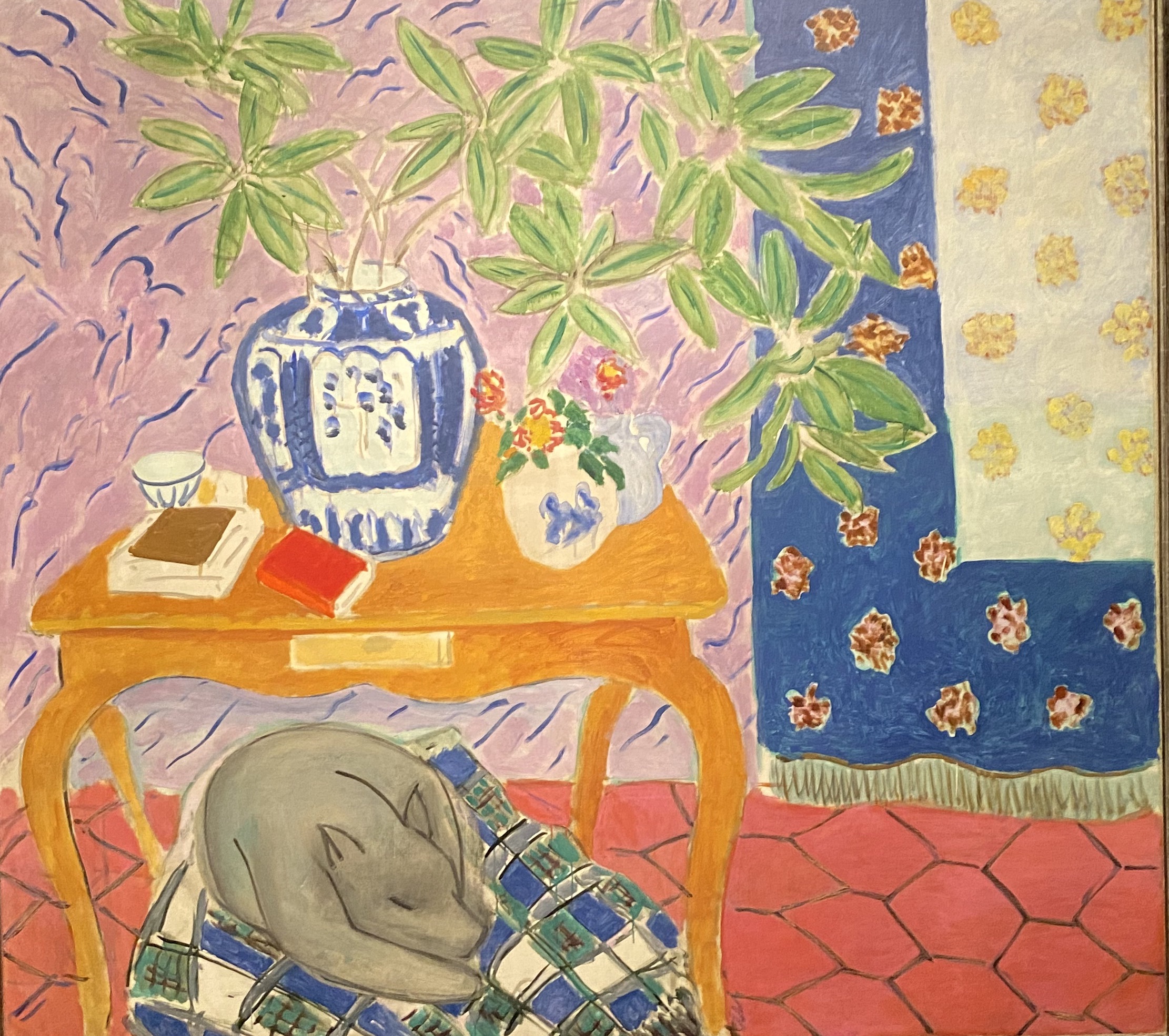
This cinematic reading is also enlivened by her color use. The colors that are used, either give the idea of a hot summer day, full of electrifying hues, or a grey, cheerless rainy day. There is no reference to any kind of ‘real’ light, which reinforces the feeling of being close to nature, being outside. And yet, the paintings have the same intensity of Matisse’s interiors, both in color as in composition: abandoned and yet full of possibilities. Her softer, more transparent colors remind me of Luc Tuymans’ interiors: clean, almost frightening, and uncomfortable. Svendsen’s work finds a kinship with Luc Tuymans in the handling of the paint and emotive subject matter. Tuymans has painted intimate, figurative works since the mid 1980s and few artists can be as closely identified with a particular palette. The best artists have managed to express their selfhood in a way that invites us to explore our own Svendsen is no exception. She is creating works which evoke an exciting interaction between what appears to be reality and what most certainly is hallucination.
Svendsen’s recent work is con- temporary, fresh and experimental. Like a déjà-vu, you are not sure if it actually happened or if it is just a combination of earlier events. She magnificently takes the traditional approach of still life, landscape, and interior and brings it to a higher, more sophisticated level. Perhaps, through Svendsen’s works, we can all dis- cover a plane of contemplation that allows for an experience unmediated by the constraints of reality. http://www.lillanita.com/