|
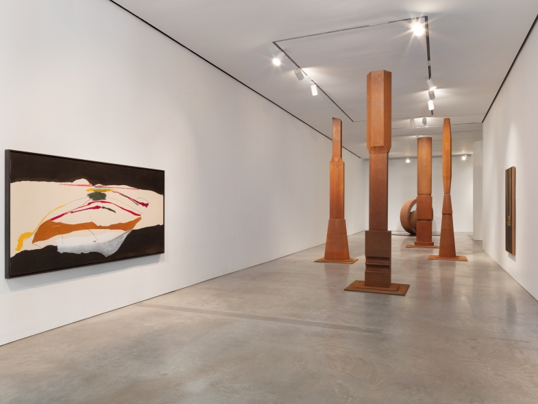
Galleries can be imposing places. The vast white cube designed to imbue work with importance often misses the mark in engulfing work within a sterile blank space. Mark Dagley’s current show at Minus Space makes me think that he is wary of this. By no means a lightweight, Dagley has put together a show that lives and breathes vitality and importance due to his consideration of the space rather than the other way around. Before even entering the gallery, one is immediately confronted by three site specific paintings leaning up against the wall from a set of carefully considered aluminum blocks. The forms of the paintings utilize the capacity of the gallery space not only in monopolizing the wall space, but also in their strikingly animated and engaging color selection. |
|


Mark Dagley, Structural Solutions, 2012. Installation shot. Courtesy of Minus Space
Mark Dagley: Structural Solutions at Minus Space
By Matthew Hassell
Galleries can be imposing places. The vast white cube designed to imbue work with importance often misses the mark in engulfing work within a sterile blank space. Mark Dagley’s current show at Minus Space makes me think that he is wary of this. By no means a lightweight, Dagley has put together a show that lives and breathes vitality and importance due to his consideration of the space rather than the other way around.
Before even entering the gallery, one is immediately confronted by three site specific paintings leaning up against the wall from a set of carefully considered aluminum blocks. The forms of the paintings utilize the capacity of the gallery space not only in monopolizing the wall space, but also in their strikingly animated and engaging color selection.
The left wall supports a massive triangular painting titled Lucifer. It is a huge isosceles triangle split evenly from the center of its longest side to the opposing right angle where the work approaches the floor. The resultant internal triangles are in active contrast, the top of the work radiating vibrant cadmium red, the bottom triangle painted a deep, rich black. The red glows forward towards the viewer, almost detaching itself from the rest of the composition. The black triangle recedes at the same time that it provides a base for the red section floating above.
Opposite the door leans a large rectangular grid painting. Luminously hovering passages of inter-dispersed bright and muted tones float forward and back, hardly contained by the sometimes transparent butter cream and black-lined grid attempting to contain and bind them. The edges of many rectangular passages have been left fuzzy, barely touching the surrounding grid. They seemingly yearn to float freely in relation to one another, moving to and fro along the imaginary z-axis.
The right wall of the exhibition space holds the most engaging of the three paintings in the exhibition. A long rectangular canvas leans against this wall. The painting is striped diagonally with taped off swaths of a muted canary yellow alternating with a steely sky blue. The widths of the colored bands appear to cunningly match the depth of the painting support. The center of the canvas has been cut and removed in two “L” shaped passages laid on their side in reflective relation to each other—one facing up, one down. These windows both open the work up for light playand expose the support of the piece to be made of standard 2 x 4 milled lumber, reminding the viewer of the physical weight of the work while providing an interesting counterpoint to the levity suggested by the playful hues selected by the artist.
With extended viewing colors can be seen to waver and come undone from the rigidity of their sturdy physical supports, creating a lovely push and pull within the viewer between bodily reality and perceptual contemplation. Dagley is quite clever with color; we have known this for some time. What this show brings to the forefront is his skill in utilizing a certain architectural space to his work’s advantage.
The paintings engage the gallery in an arrangement of forms serving to elucidate the painter’s decisions more than call attention to themselves regardless of their towering stature. Dagley’s work does not press itself on the viewer with it’s sheer size as much as it makes every creative decision of the artist utterly present, both due it’s proximity to the eye and the cohesiveness of its aesthetic consideration.
If we chose to follow the logic argued by Hal Foster in his recent book The Art-Architecture Complex, the design of the institution presuming the role of displaying the work is necessarily reflective of the curatorial tastes of the time. Maybe this work exists only for this very art-historical moment and space. Wouldn’t it be fitting if the work were only to be shown in this particular gallery location, to be bought and sold according to changes in ownership? Surely that would be positioning the artist in an entertainingly complimentary relationship to the gallery institution—one few would deserve more than Mark Dagley.