Cary Smith: The words in your paintings seem funny, ambiguous, and have a precision about them, all at the same time. Where do they come from, and what do they mean to you?
John Phillip Abbott: The words come from memories and personal experiences. For example, a painting might reference my first car, a Pontiac Fiero, or a girlfriend from high school, Kamisha. Painting words or names that I have a connection with allows me to draw from entire blocks of time associated with that word or name, and to arrive at informed formal decisions. If I paint words that I think sound cool, or look cool, without any association whatsoever, the images feel contrived. I think the specificity of certain words and names, and not others, make the paintings often seem funny. For example, my paintings of Fred Lynn, a baseball player from the 70’s, might seem really random, but somehow specific too. It turns out that my dad had taught Fred Lynn when he was in middle school. When I was growing up and found this out, it was quite exciting for me. As a result, I have painted paintings of Fred Lynn, but wouldn’t choose to paint someone I have no connection to like, say, Jim Rice, another baseball player from the 70’s. I think there is some inherent humor in the perceived randomness of the use of his name.
The choice of words comes down to personal and formal associations. The words are also ambiguous enough to suggest alternate meetings and are not bogged down, or defined, by only my experiences.
Most often I have a pretty good idea what I want to paint. Like a sort of plan, but I’m still open during the process, and continue to have a dialogue with the paintings as I make them. Sometimes the paintings become something quite different than the original plan. The idea is to avoid being formulaic. I force myself into new directions when things begin to feel repetitive, like using old colored t-shirts as a painting ground or substrate. At the same time, I’ve been finding many new possibilities in using the same language and formal elements repeatedly.
CS: I’m also fascinated by your painting technique. It seems that you create the images of the words, and other shapes, by leaving areas unpainted, and by layering. Also, you seem to predominantly use spray paint. Tell us about this.
JPA: I’m striving for an economical and direct image and spray paint offers a way to achieve both, simultaneously. With spray paint, I don’t feel in control as much. I enjoy accidents, such as the bleeding that occurs under some taped edges. I’m also able to cover large areas fairly uniformly and quickly. It continues to amaze me. Sometimes I’ll use a brush and acrylic in areas as a counterpoint to the mechanical uniformity of a spray painted surface.
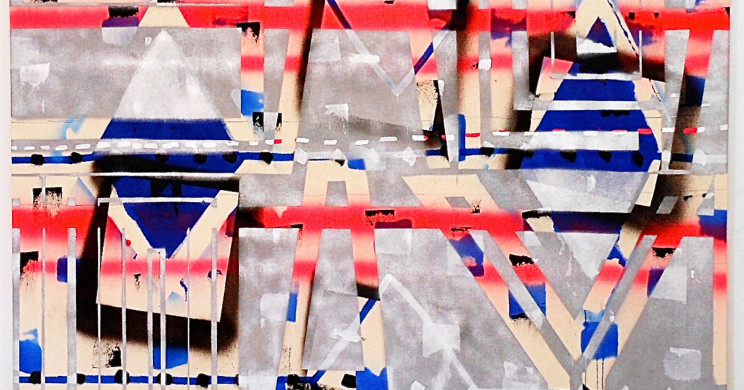
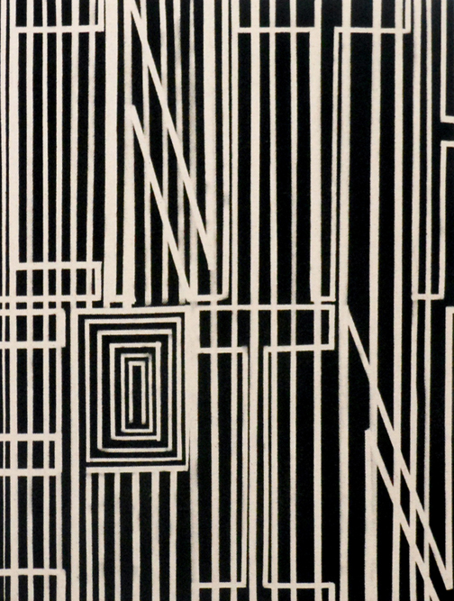
I am interested in having a connection to the historical the use of the grid. Letters make direct connections to verticals, and horizontals, and in some cases diagonals, as is the case with the letter “k”, for example. The diagonals can be used to create triangles, and diamonds as well. Other shapes and lines can be layered on, and within, words in each painting. Layers of all of these elements allows for figure/ground play, resulting in the melding of image and text; reading and seeing.
John Phillip Abbott, In the Pines, 2013. Spray paint on unprimed canvas, 16 x 12 in.
CS: In some of your paintings you use only one color and in others there is a complex chord of colors. Yours colors have a fresh brightness about them. They seem sophisticated yet youthful. What are your thoughts about color?
JPA: When I was in the fifth grade, in the mid eighties, all the cool kids had really wide, fluorescent shoelaces. I was all about those laces. I even dreamt about them. I’ve been preoccupied with those colors ever since. Fluorescent, metallic, and other highly saturated colors find their way into the studio, but from there, decisions happen very intuitively. I most often use one or two colors in the smaller paintings, whereas in the larger paintings there is more room for intuitive mark making, and surprising color combinations.
Here in New Mexico where I live, the light is incredibly bright. It has definitely been an influence on the intensity of the colors that I use. Sometimes however, a need arises for the use of less bright colors. For example in the painting In The Pines, I used only black paint on the raw canvas ground. In The Pines was inspired by the Huddie Ledbetter song of the same name that I grew up listening to. The color choices were informed by the title of the song, whereas in other paintings the title may be a response to the intuitive use of color.
CS: I’m interested in that “sweet spot” where looseness and accuracy in a painting meld perfectly. Do you think about this?
JPA: I do, and this has led me to use tape in my process. I use tape as a tool to organize space. It also provides an economical structure that corrals previous layers. With the tape I’ve also found that there can still be a human presence, and evidence of the hand. A tear, or an imperfect cut of the tape, using a ruler and blade, becomes indexed in the process.
I’ll often begin painting with acrylic and brush, or spray paint. Referencing the grid, with stripes, dots, diamonds, etc. I know the “sweet spot” will be arrived at when these layers, applied relatively quickly, will be overlapped with the perceived accurateness of the tape and slowness of it’s application. Eventually there is a zeroing in, and this is when a loss of time occurs and I find myself concerned only with the success of the image. In that moment, nothing else matters. *