Solving the Problems of the Painted World

Kathy Feighery: I think that’s what a lot of my art is about, teetering on the edge between abstract and representational. There’s a landscape quality, especially any time you draw a horizon line.
[Referring to an old ink drawing from a couple of years ago] I dug this out recently, thinking it was very figurative with this sort of dance movement. So I’ve been doing this series of dress painting based on christening dresses. I was at a christening a couple of months ago and it was for a little boy. He wore a dress and I thought it was so interesting.
Richard Butler: He’s not English is he? (Laughing)
KF: No, no. I just had this idea that there’s this sort of asexual quality, especially infants, that you know both little girls and little boys both wear these sorts of elaborate dresses. The idea behind some of these, my approach is that I wanted these to read as portraits in some sense, they have their own individuality but also I didn’t want them to be purely representational and I wanted them to still incorporate the stuff about painting that I love, which is the paint and the materials.
RB: Why not purely representational?
KF: Because I wanted the viewer to read more than a sort of narrative. I wanted them to be viewed on an aesthetic level.
RB: The reader is going to put a narrative to them anyway.
KF: Right, but I think that, with the application of the paint, the material and the mixed media that I use, your initial reading doesn’t end there, hopefully I can engage the viewer on a more tactile level. Before that, I was doing more Hudson Valley landscape type things based on the river, big sky.
RB: The landscapes are more figurative than the dresses were.
KF: Yeah. The landscape was basically a reaction to living in this area. I wanted to capture the dynamic kind of drama, the dramatic quality of the light.
RB: I know what you mean. You’re working with paint. You don’t want to try to make the paint to look like something other than what it is. It has pleasures of its own, otherwise you could be taking photographs of dresses or making dresses and photographing them, but there’s just something about paint.
KF: Yeah.
RB: I think that everybody who’s doing representational stuff comes across this place, how much they want it to look like paint and how much do they want it to look like the thing they’re painting. I like narrative especially seeing as how I do figures you can capture. There’s that old corny thing about capturing somebody’s soul. You know, you can do paintings and some really don’t do anything, they give you nothing back and then other paintings give you something back which is ultimately what I am after, just to feel something. I’ve got this English distrust of the abstract and I think English abstract painters are notoriously second rate. (Laughter)
I can remember reading quotes from both Francis Bacon and David Hockney, and how they both distrust and disliked abstract painting and I think it was Hockney who said it’s decoration. I think Francis Bacon said it was absolute rubbish. I think he said Pollock’s stuff looked like old lace.
KF: That’s an interesting perspective but I disagree. I think I get just as much emotive stuff off an abstract painting as I would a figurative painting.
RB: That’s where it becomes really subjective. I don’t, I absolutely don’t.
KF: Are there any abstract artists that you are more attracted to than others?
RB: I was always kind of suckered in slightly by Rothko because his paintings were so somber, especially the end ones. There used to be a Rothko room at the Tate Gallery that had the ones or very similar ones that are in that Houston Chapel. I used to go in there because I liked the quiet of it and the thing he said about these forms advancing and receding, stuff appearing. But in retrospect, actually, Francis Bacon
says about Rothko that you could get a bolt of old cloth and get the same effect and I agree actually, I think he’s right (laughing).
KF: Except that when you’re in front of a Rothko. For me what’s going on with a Rothko has more to do with what’s going on with the color field shifts. There’s a real, for lack of a better word, spiritual thing going on. I think those planes of color are incredibly dynamic.
RB: I think that means you’ve bought it and I just haven’t. I don’t think he’s a fantastic colorist at all. Those early bright ones are horrendous.
KF: The later ones are more subtle.
RB: They’re better. They’re pretty. That’s the word
KF: Pretty extraordinary.
RB: (Laughter) I would just say pretty. I distrusted it. On the other end of the spectrum you have someone like Anselm Kiefer who brings so much narrative to it you really can’t get it from the painting. You have to read all this stuff and everything I’ve read about Kiefer is so horrendously pretentious, but just as things to look at, I think some of (his works) are stunning.
KF: The first time I saw Kiefer’s work was in a book, which was sort of an interesting way to approach his work because his stuff is so visceral when you’re there in front of it, such a presence, such a physicality about it. So when I saw in a book I was able to get a more of sense of it, the painting, the whole painting because they’re so enormous, most of them that when you’re standing in front of them you can’t take in the whole thing. For me, I could read the composition and the light. And then when I got to stand in front of it, the stuff is three-dimensional. I was really excited.
I came from a real sort of colorist background, that’s how I started that’s how I learned to paint, so that’s why I have a big appreciation for that.
RB: With Kiefer?
KF: No, some of the more abstract painters. I was a painter before I was a drawer. For me, it was a perfect sort of entrance into making art, playing around with color fields and just paint.
RB: I come from the other way. I’m more a drawer than I am a painter.
KF: (pointing to one of his paintings) That feels like a drawing to me.
RB: Yeah, all of my stuff is pretty much drawing.
KF: There was a piece in your show here that felt very much like a painting.
RB: (Laughter) That was a failure.
KF: See, that is the one I was most attracted too (laughing).
RB: Some of Kiefer’s stuff is amazing. For one, I love his touch. He has this very clunky, clumsy touch.
KF: Yeah, awkward.
RB: Julian Schnabel has that same touch.
KF: I was watching a program and at the end Julian Schnabel was out at his house on Long Island. He was working on the Geisha paintings. They filmed him while he was working and his powers of illustration were masterful and (he had) a very light touch and I was sort of surprised because I always just assumed that he sort of, you know, ran at everything.
RB: It’s funny you should say that. Some years ago I was out at Montauk visiting him because we became friends, God knows how I remember. He put on an early Psychedelic Furs cassette and we were out there painting in the rain. He was painting this painting with his hands basically on this huge canvas and he said "What do you see in that? What would you do"." And I said "I’d put in this purple shape down there." And he says, "Go on then." He called his assistant over and said "What color?" And you know he got the color and I put it on and it looked bloody awful and I thought "Oh my God, there really is more to it than just plastering it on." And I thought I had done something unfixable and then he came along and just stuck like a line through it the changed it slightly and it worked again. I got an appreciation for what he does from that.
(Look at another Butler painting.)
KF: What’s this all about? (KF is looking at a Butler painting called "Benzene Poster Girl at Wiesbaden" that has black patches covering parts of a woman’s face.)
RB: To me, they’re just like holes. I first started using black shapes as a kind of compositional device because I would do a painting and then it wouldn’t work. So I’d put some black shapes in and some white shapes on it and they came to represent, because we all like to make up narratives about stuff (laughing), they came to represent wholes through things.
KF: The first time I saw it, it reminded me of when I was a kid living in Ireland. There was this cartoon and this character had these black circles and when he was trying to get away from whoever was chasing him he would throw them against the wall and climb through them. (Butler laughs) They were sort of like escapist holes I guess. So talk about your process.
RB: My process, it’s funny because having said before that I come from drawing, I actually do all my drawing these days on a computer. All my work is put together on a computer in Photoshop. You know, I’ll take a photograph and I’ll change the scale of the head. I spend a lot of time actually making things, like these very large beads and beaks and ears which I was doing a lot of before.
KF: On the painting or in Photoshop
RB: No, in real life. And then I’ll dress somebody, usually my daughter or my ex-wife in this gear and then I’ll take a photograph and put it into Photoshop and change the scale or something, the size of the hands or the size of the head or whatever, until I get something emotional back from it due to the shift in scale. I’ve being doing a lot of people with huge shoulders and tiny heads recently (laughing) for whatever reason I don’t know.
And they suffice as the drawings for what I do. And then like we were saying before, they could be things just as they are, but I love the texture and what paint does. I like translating reality into paint and so that’s where the painting comes in. It’s easy to be less successful when you’re working from photographs because you’ve got to stop yourself imitating the photograph and let it be a painting. I’ve had lots where I’ve just had to scrap it.
KF: It’s interesting that you haven’t mentioned, when I look at your portraits what comes to mind in terms of art history I make more of connection with the Flemish painters.
RB: Oh, I look at a lot of those. I love that they would paint very very high tones, the shadows even were very slight variations. It wasn’t that Rembrandt sort of dark brown chiaroscuro. It was almost sort of flat and I love some of those paintings.
KF: You’re starting to see the figure come back over the last 10 years.
RB: Oh a lot. All these painters like Elizabeth Payton and Dana Schutz all getting phenomenal prices for their work. Both of those painters, there are very attractive things about their work, but I don’t know how much I actually like it and how much of it is this whole gallery promotion game. But there are a lot of people painting like Elizabeth Payton now and I don’t know who came first. And then of course, there are all those Germans that have come out recently who do an excellent job of it, Neo Rausch.
I still go to visit my Mother up in Yorkshire. She’s a painter actually. She paints little bunches of flowers and still lives very well (laughing). She’s not really fussy at all which is to her credit. She’s very good with a brush, she’s very loose.
KF: Have you always drawn and painted?
RB: Yeah pretty much. I wanted to be a painter and my mother had this thing where she would always sell her paintings, still lives and stuff like that. Then she started getting commissions to do people’s portraits at which she was absolutely useless at. So she’d give me the photograph that they’d provided and I’d sit there and draw it out for her. Then she’d add all these floral brush strokes and we’d split the money, which was a great game. (Laughter)
KF: Did people think that she was doing it?
RB: Oh yeah, yeah. I was an assistant, yeah. And then I went to Art School. It was a very traditional art department. In fact, I think Cecily Brown went to it as well.
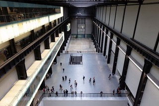
KF: What do you think of the Dia Collection?
RB: Oh, I’m not a big fan at all.
KF: (Laughing.) I had a feeling you were going to say that.
RB: Are you?
KF: No. I do, you know, love the building. I’d like to have a party in there.